9 Landing Page Tricks You Can’t Ignore
In our extensive experience as website strategists spanning five years, we've meticulously tested over 120 techniques to enhance landing page conversions. Out of all these methods, only nine delivered impactful, measurable results—and the best part is, these strategies are simple enough to implement quickly, even if you're new to marketing. By applying these actionable tips, you'll gain a clear path to creating high-converting landing pages that capture your audience's attention and drive engagement. Whether you're a seasoned marketer or a beginner, these tried-and-tested strategies can help you see immediate improvements in performance.
1. Use Social Proof Above the Fold
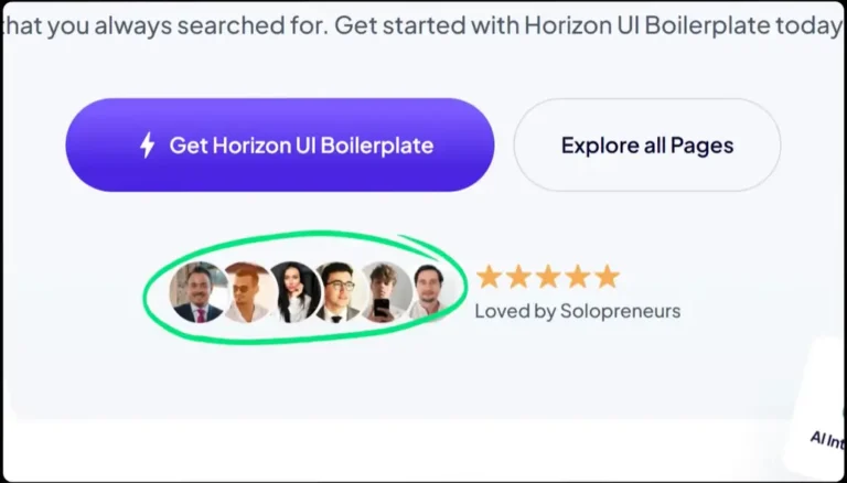
One of the most powerful ways to gain visitor trust is through social proof displayed prominently above the fold. This visible area is the first thing users see when landing on your page, making it the perfect spot to establish credibility.
Effective social proof elements include:
Customer photos: Images of real users create relatability.
Testimonials: Strong, concise quotes that highlight user satisfaction.
Logos: Recognizable brand affiliations add authority.
Real-time notifications: Show recent user activities, such as “John from New York just signed up.” This can increase conversions by as much as 15%.
By placing these elements early, you immediately communicate that your product or service is trusted and valued.
2. Write Attention-Grabbing Eyebrow Copy
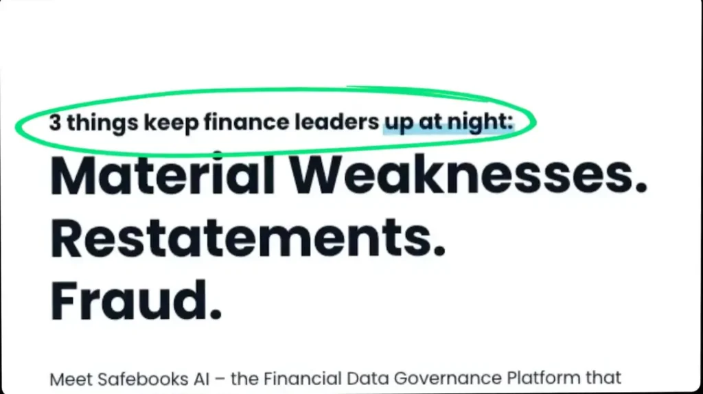
Eyebrow copy—a brief, compelling line positioned above the main headline—is a powerful yet often underutilized tool for enhancing user engagement on landing pages. By setting the stage for the primary message, it immediately provides context, builds credibility, and captures visitor attention.
Why Eyebrow Copy Matters
Eyebrow copy serves as a pre-headline element that guides users toward understanding the value proposition without requiring them to read extensive content. This strategic positioning can increase clarity, engagement, and trust from the very beginning of the user experience.
Examples of High-Performing Eyebrow Copy
Here are some tested examples that illustrate how eyebrow copy can subtly but effectively shape visitor perceptions:
- “Trusted by 50,000+ professionals worldwide” — Builds trust by highlighting a strong user base.
- “The go-to solution for small business owners” — Reinforces a niche-specific solution.
- “Say goodbye to manual processes forever” — Promises a compelling, user-centric benefit.
Best Practices for Crafting Effective Eyebrow Copy
- Keep It Short and Relevant: Aim for no more than 10 words to maintain readability.
- Highlight Social Proof or Benefits: Mention user counts, awards, or pain points solved.
- Align with Main Headline: Ensure the eyebrow copy flows naturally into the primary message.
- Use Action-Oriented Language: Encourage curiosity or engagement by hinting at a benefit.
Incorporating a well-thought-out eyebrow copy can significantly improve the impact of your landing page. By subtly setting expectations, it guides visitors toward meaningful engagement and conversion actions from the outset.
3. Keep Copy Conversational and Human
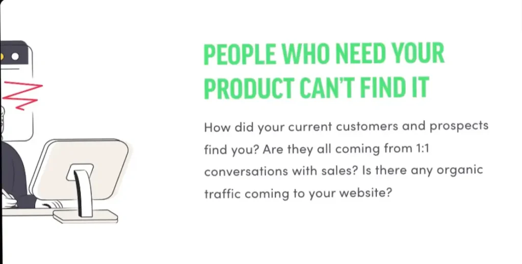
When crafting landing page copy, aim for a conversational tone rather than a formal lecture. Using friendly and approachable language helps build rapport, encouraging visitors to engage with your content and connect with your brand on a personal level.
Key Tips for Writing Conversational Copy:
Keep Sentences Short and Simple: Avoid long, complex sentences. Short, direct sentences are easier to read and understand, leading to better engagement.
Ask Questions to Engage Your Audience: Incorporate questions like “Looking for a simpler way?” or “Ready to get started?” to invite readers to interact with your message.
Use Contractions for a Natural Tone: Instead of formal phrases like “we are,” use contractions like “we’re” to sound more conversational and approachable.
Make Your Content Relatable: Speak to your audience’s pain points, goals, and desires. The more relatable your content is, the longer visitors will stay on your page, increasing the chances they’ll take the desired action.
By following these tips, you can create landing page copy that resonates with your visitors and encourages them to take action.
4. Use Testimonials with a Purpose
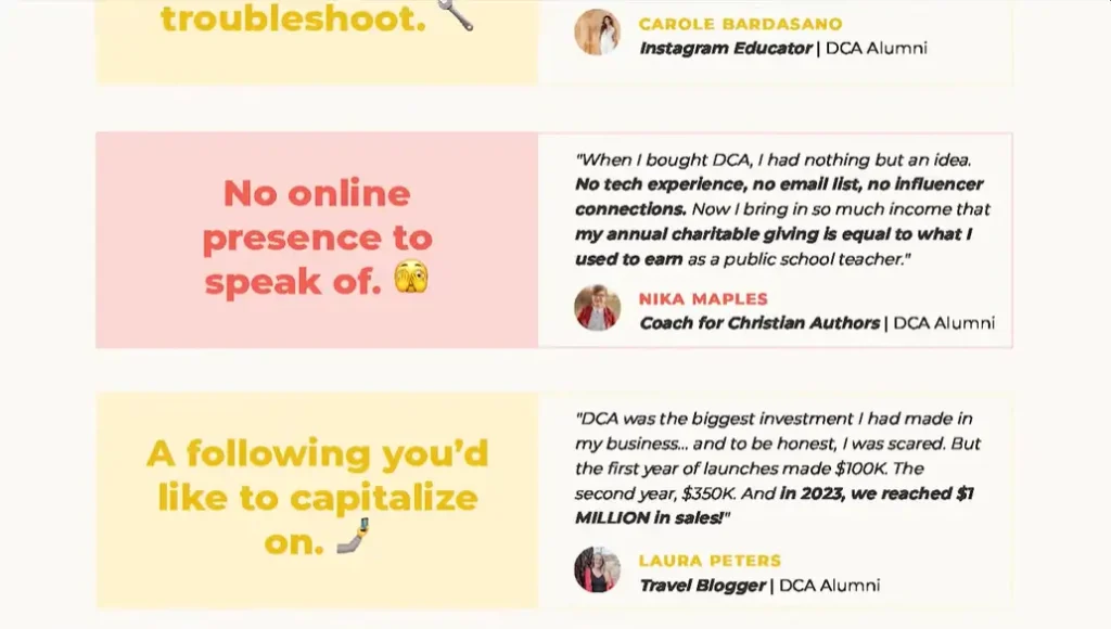
Not all testimonials are created equal—the placement and relevance of each matter significantly. Position testimonials strategically to counter objections and reinforce claims.
Where to place testimonials:
Near pricing sections to alleviate cost concerns.
After describing a key benefit to validate it.
In sidebars or pop-up overlays.
For example, if your landing page promises “increased efficiency,” follow this claim with a testimonial like, “Thanks to [Service], our workflow improved by 40% in just two months.”
5. Leverage Video Testimonials with Key Takeaways
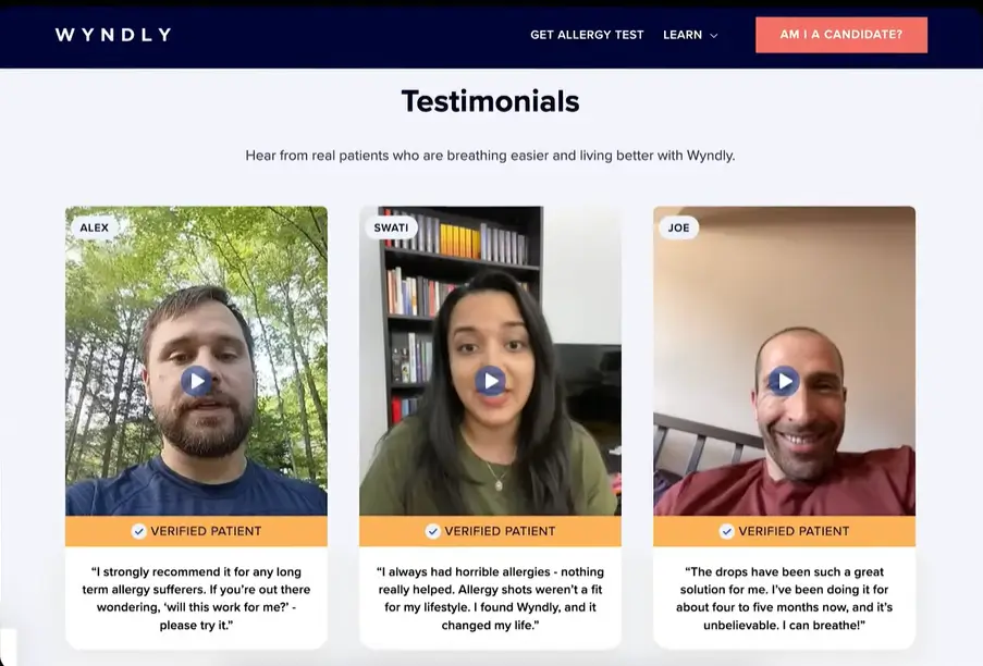
Video testimonials are a powerful tool to build credibility and establish trust with your audience. However, many visitors may skip watching videos due to time constraints or limited attention spans. To maximize engagement, it’s crucial to ensure your message is conveyed even without requiring viewers to hit the play button.
Here’s how to do it effectively:
Highlight Key Quotes: Extract compelling statements from your video and display them prominently as headlines or captions. These snippets should capture the most impactful benefits or results.
Example:
“We doubled our sales in just three months using this service.”
Use Supporting Text: Provide a brief summary of the video content next to or below the video player. This offers context and encourages more users to press play.
Optimize Placement: Position video testimonials near crucial decision points, such as next to call-to-action buttons or alongside sections that address user objections.
Add Captions: Ensure your videos are captioned. Many users watch videos on mute, especially on mobile devices.
Pair with Strong Visuals: Incorporate attention-grabbing visuals, such as customer logos, success metrics, or before-and-after scenarios to reinforce the message.
By combining engaging visuals, impactful text, and well-placed video testimonials, you can effectively communicate value and boost conversions even among non-video watchers.
6. Implement a Comparison Table
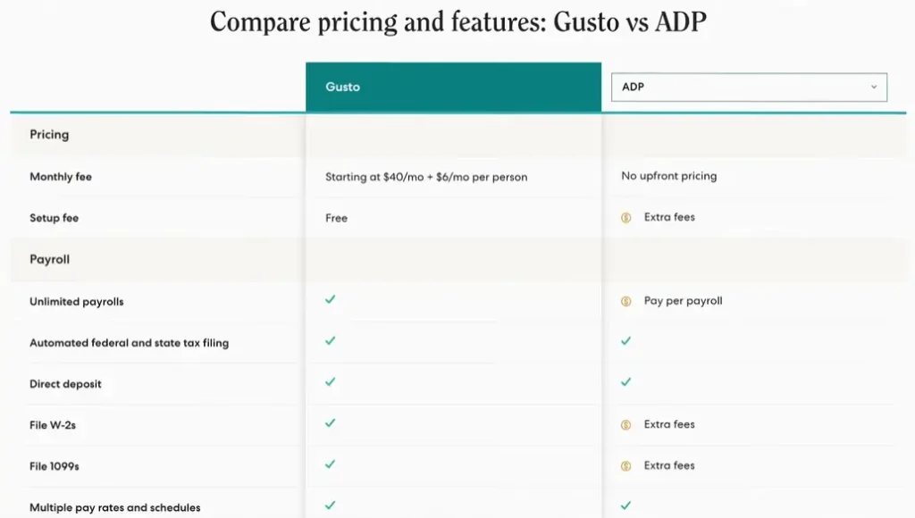
A well-designed comparison table visually highlights your product’s strengths compared to competitors or alternative methods.
Example Comparison Table:
| Feature | Your Service | Competitor | DIY |
|---|---|---|---|
| Personalized Solutions | ✓ | Generic Templates | X |
| Time Efficiency | ✓ | X | X |
| Customer Support | ✓ | Limited | X |
This format allows potential customers to quickly grasp your competitive advantages.
7. Highlight Benefits, Not Just Features
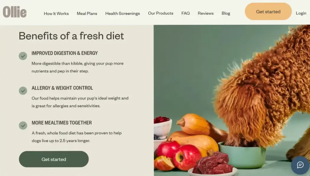
While features tell potential customers what your product does, benefits explain why those features are important to them. People don’t just buy specifications—they buy solutions to their problems. That’s why transforming your product features into clear benefits is essential for driving conversions.
Feature-to-Benefit Translation:
- Feature: AI-driven scheduling
Benefit: “Save hours every week, giving you more time to focus on what really matters—growing your business.”
By framing your product features as benefits, you speak directly to your customers’ emotional and practical needs. This makes your product more appealing, as customers can instantly see how it improves their lives or solves their challenges.
Why Benefits Matter More Than Features in Marketing:
Benefits Tap Into Emotions: Benefits connect on a personal level, speaking to what your customers care about most, whether it’s time-saving, stress reduction, or achieving goals.
Clear Problem-Solution Approach: Benefits address the “what’s in it for me?” question that every customer has in mind. They’re looking for solutions, not just products.
Better Conversion Rates: When you highlight benefits, you show customers the real value of your product, which often leads to higher conversion rates and sales.
Optimize Your Landing Pages by Focusing on Benefits:
When crafting landing page copy, focus on how your product solves problems rather than just listing features. Use the benefit-driven approach to keep visitors engaged and motivated to take action.
By shifting the focus from features to benefits, your marketing copy will resonate more deeply with your audience, helping them see the immediate value your product offers.
8. Include a TL;DR Call-to-Action Panel
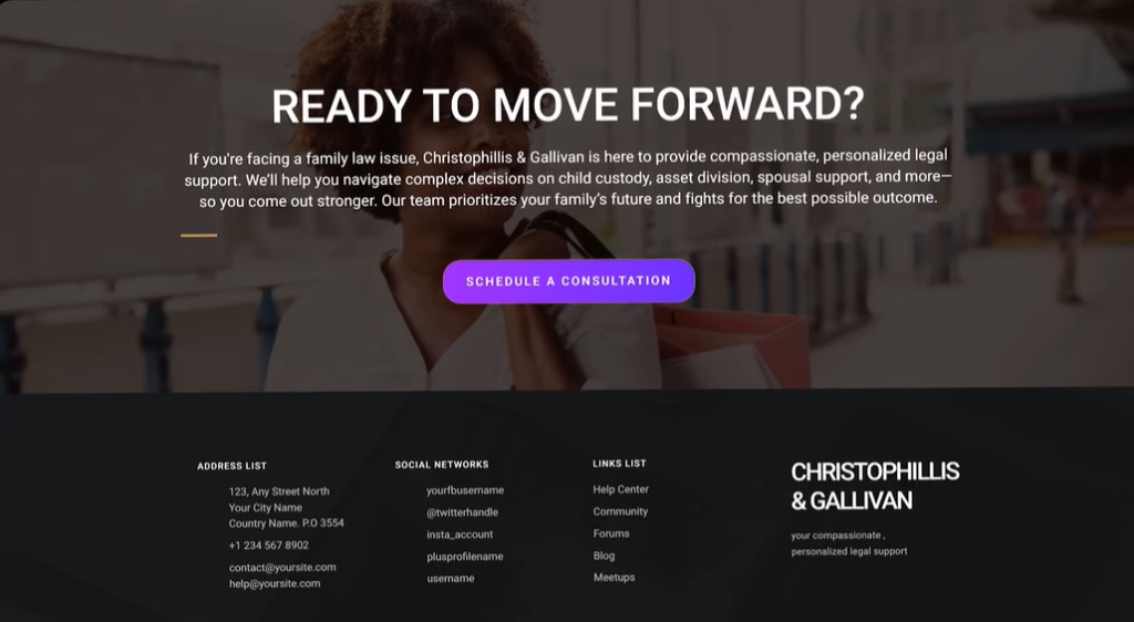
Many website visitors prefer to skim content rather than read it in full. For these users, providing a concise summary panel at the bottom of your landing page can reinforce your key messages and prompt them to take immediate action.
Example TL;DR Section:
“Get personalized marketing strategies that save you time and double your leads. Ready to grow? Click below to get started today.”
This quick recap highlights your value proposition and guides users toward conversion with a clear call-to-action (CTA). A well-crafted TL;DR section ensures you capture the attention of skimmers and encourages them to act fast.
Why a TL;DR Section Works:
Quickly Recap Key Points: Visitors can get the essential information at a glance without needing to read the entire page.
Improved Conversion Rates: A concise call to action directly after the summary prompts users to take action, improving the likelihood of conversion.
SEO Benefits: By reinforcing your primary messages and keywords in the TL;DR section, you help search engines understand the main focus of your page.
Optimize Your Landing Page with a TL;DR:
Incorporating a TL;DR section into your page design not only improves user experience for skimmers but also boosts your conversion rates by making it easier for visitors to decide. Plus, with the right focus on keywords, it can enhance your SEO performance.
9. Reinforce Your CTA with Reassurance Copy
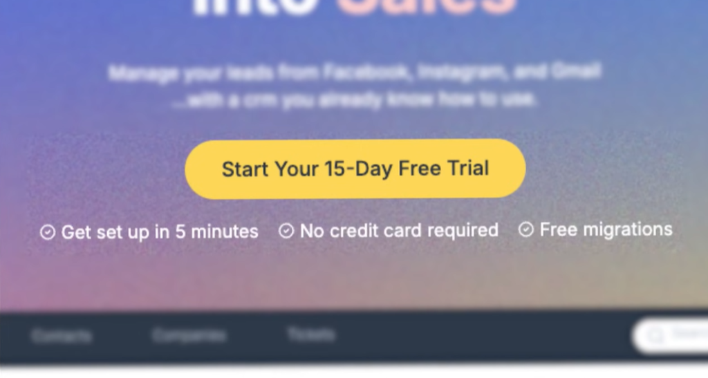
Reduce Friction with Reassurance Copy on Your Call-to-Action (CTA) Buttons
Visitors often hesitate before clicking a call-to-action (CTA) button due to concerns or uncertainty. Adding reassurance copy near your CTA can help alleviate those concerns and reduce friction, ultimately leading to more conversions.
Effective Reassurance Copy Examples:
- “No credit card required”
- “Set up in just 5 minutes”
- “Cancel anytime, hassle-free”
By addressing potential objections directly, such as concerns about hidden fees, long setup times, or commitment, you make the decision to click your CTA much easier for visitors.
Why Reassurance Copy Works:
Builds Trust: Reassurance copy helps establish confidence in your visitors by removing any doubts about the process.
Reduces Hesitation: Visitors may fear risks, so offering clear, easy-to-understand benefits (like “Cancel anytime”) removes those roadblocks.
Increases Conversion Rates: When users feel confident in taking action without hidden surprises or commitments, they’re more likely to convert.
Optimize Your CTA for Higher Conversions:
Incorporating reassurance copy can make a big difference in how users interact with your CTA. By highlighting simple, clear promises, you create an environment where visitors feel safe and encouraged to take the next step.
By implementing these nine proven hacks, your landing page can become a high-converting powerhouse. Whether you start with one change or all of them, even small improvements can yield significant results. Remember, every element on your page should guide visitors toward taking action. After getting new email subscribers you can send the email campaign or email sequence.

